
Blender Add-on Components
Overview
While not necessarily required in order to export models from Blender to create Hubs scenes, the Hubs Components detailed below will let you add a variety of useful functionality, interactivity, and immersion.
Animation
Loop Animation
The ‘Loop Animation’ component will let you play looped animations stored as NLA (non-linear animation) tracks in your Blender scene. The component supports multiple animation tracks per mesh, and even allows control over the playback speed (called ‘Time Scale’ in Blender) of the animation within Hubs. Even a negative playback speed is possible, resulting in an animation playing backwards. Additionally, animations can have a ‘Start Offset’ value, which offsets the first frame of playback. In doing so, you could (as an example) animate a wind turbine once, duplicate it in your scene, and add a frame offset in your loop animation component so that they weren’t both turning in exact unison.
In the following example, a 1m cube is the child of two nested empties. The parent empty (cubeEmpty_X) has an NLA animation track that moves 2m in X over 30 frames, then moves back to its start position over the course of another 30 frames. The top-level empty (cubeEmpty_Y) has an NLA track where it moves -2m in Y over 30 frames, then returns to the start position, like the first. The combined effect of both loop animation tracks played together looks like the following:
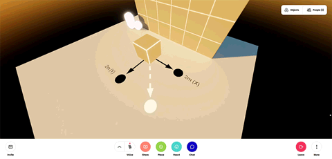
- Two overlapping loop animation tracks and their combined effect.
If then you add a 15-frame (one quarter of the total) ‘Start Offset’ value to one of the empties, you get this:
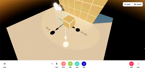
- Two overlapping animation tracks with a start offset applied.
The ‘Loop Animation’ component is commonly used on ambient scene animations as well as avatar animations (such as idle eye movements).
UV Scroll
The ‘UV Scroll’ component allows you to scroll an object’s texture according to its UV layout along either the U or V axis (or a combination of both). UV scrolls are a widely used way to add animations to real-time 3D scenes with their origins stretching all the way back to the early days of 3D video games. Using scrolling UV’s you can animate an overhead layer of clouds, a water surface, wisps of wind, a scrolling marquee, and all sorts of other environmental effects. They are an inexpensive way to add character and visual interest to Hubs scenes.
 A plane using the ‘UV Scroll’ component to scroll its texture in the X direction.
UV scroll has two basic settings. ‘Speed’ lets you determine how fast the scroll occurs in both the X and Y (U and V, respectively) directions. An X value of 1, shown above, means that the texture will scroll as if its UV islands had moved 1 unit to the right over the course of one second. If you wanted it to move at half that speed, a value of 0.5 would be used, resulting in the scroll taking twice as long (2 seconds) to complete one cycle. Speed in this way can be thought of as cycles per second, so if you wanted a cycle to take an entire minute, you would use an X speed value of 1/60, or 0.016667.
The second option is called ‘Increment’ and lets you specify the number of incremental steps to move the texture over the course of one second. An increment X value of 0.1 would move the texture 1/10th of the way from 0 to 1 (in the U direction) a total of 10 times in one second, for a stop-motion sort of look.
- The same scroll speed as above with an increment value of 0.1.
We can take advantage of this effect by using long strips of animations in a sort of virtual flip-book, allowing the playback of things such as blinking lights, all the way to full-blown GIF animations.
Avatar
Personal Space Invader
The ‘Personal Space Invader’ component is a special Hubs component that is automatically attached to Hubs avatars and makes it so that when someone gets too close to you, their avatar becomes transparent so that they do not block your view or otherwise be bothersome by being too close.
Morph Audio Feedback
The ‘Morph Audio Feedback’ component is specific to avatars and allows a Blender ‘Shape Key’ to be triggered when a user is speaking. This is commonly used for mouth shapes, so that a mouth appears to open and close when someone is talking.
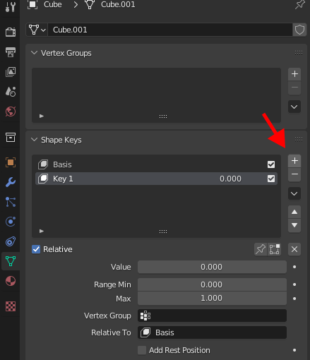
- Click to add a new ‘Shape Key’.
To achieve this, two shape keys must be created on the mesh item in question. The first key Blender will call “Basis” by default - this is the starting position of your mesh as you created it. When you press the ‘+’ button a second time, it will create a 2nd shape key for you. This is where you will create your open mouth shape. Rename this 2nd shape key to whatever you like, but use something you will remember as this name will be important later.
With the 2nd shape key selected, increase its ‘Value’ to 1, then go into edit mode. While in edit mode, change the mouth shape so that it is making the desired open-mouth shape. When done, exit edit mode. You can now click and hold and scrub the value field to see your mouth open and close. Set this back to 0, and click the ‘Basis’ so that it is highlighted.
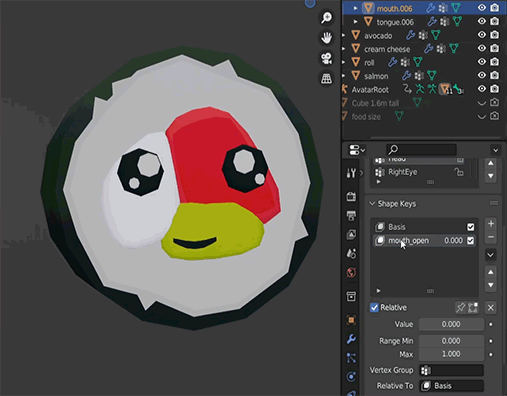
- Scrubbing the shape key value field to preview the effect.
The last thing you will need to do is add the component itself. With the mesh selected, click to add a Hubs component and select ‘Morph Audio Feedback’. In the ‘Shape Key’ field, click the dropdown menu and select the shape key that you created and named earlier. Use the ‘Min Value’ and ‘Max Value’ fields to fine-tune your avatar’s mouth shape as it responds to the input audio. For example, I frequently set ‘Max Value’ to 2, which helps to ensure that the mouth animation is visible even when a user is speaking at a low volume; sometimes the opening and closing effect can be too subtle when the max value is left at its default value of 1. You will need to do some experimenting to find what works best for your application.
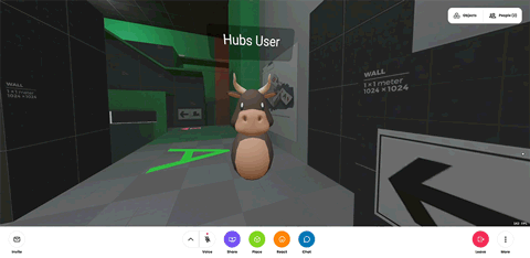
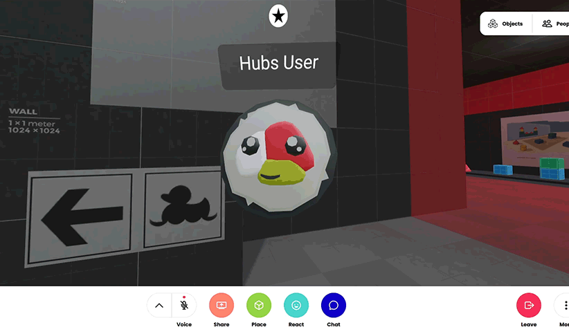
- A speaking Hubs avatar using the ‘Morph Audio Feedback’ component.
Scale Audio Feedback
The ‘Scale Audio Feedback’ is used to scale a portion of an avatar mesh when the user is speaking. This is commonly applied to the head of the avatar mesh and is an added layer of visual feedback when someone is talking.
This component can be applied directly to the mesh, at which point it will automatically scale all verts weighted to the ‘Head’ bone, as well as every child bone. If the component is applied to the armature, it will scale all of the verts associated with that particular bone and its children.
Using the ‘Min Scale’ and ‘Max Scale’ values will let you fine tune the amount of scale that occurs during speech. By default, the affected mesh will start at a scale of 1 and scale all the way up to 1.5 times its starting size at full speaking volume.
- A speaking Hubs avatar using the ‘Scale Audio Feedback’ component.
Elements
Link
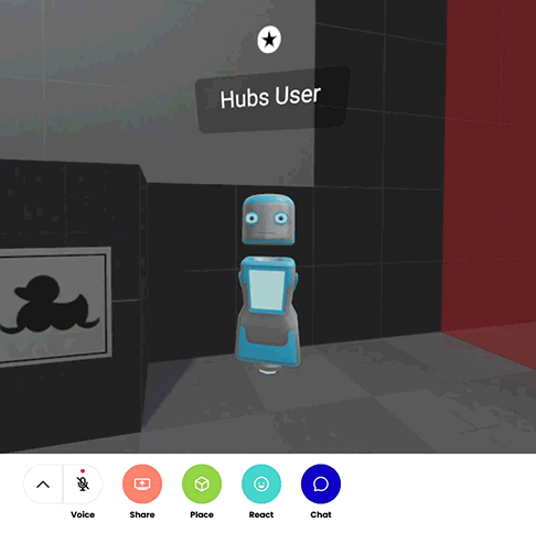
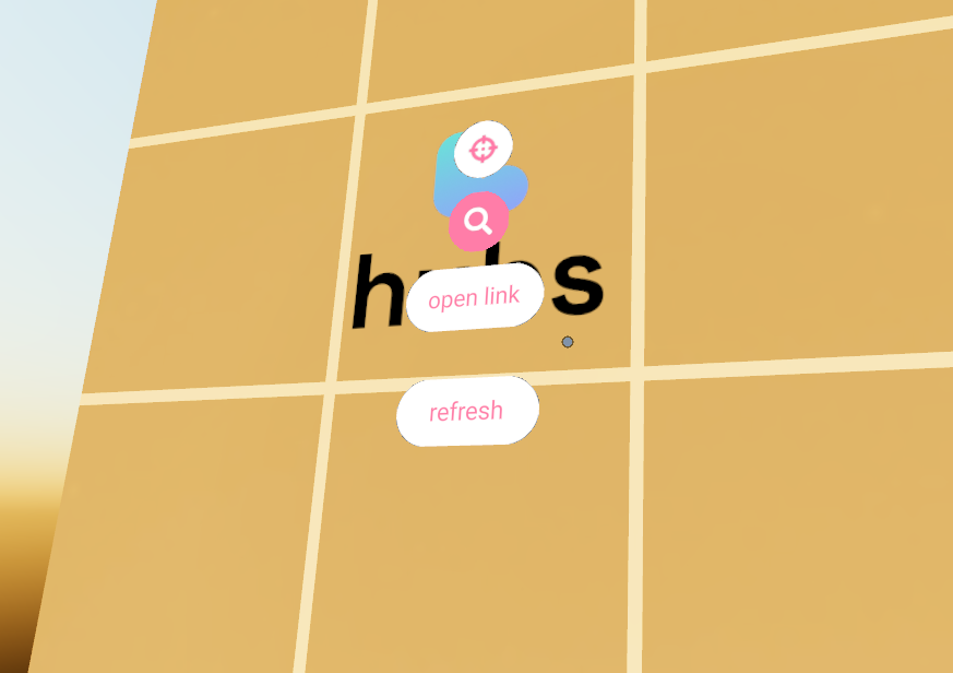
The ‘Link’ element works much the same way as the ‘Image’ element and allows you to place a clickable 2D representation of a website link in your Hubs scene. Clicking the link will attempt to open the resulting URL in a new browser tab. Link elements are commonly attached to empties, just like the image element, and are positioned and sized the same way. (See the ‘Image’ element section for more information.)
- A clickable ‘Link’ element at the default (1m wide) size.
Link elements can also be attached to other objects as well. For example, once in a while Hubs will fail to render a preview image of a website as the clickable image for the link due to the complexity of the website in question. In this case, it is recommended to use an ‘Image’ element displaying a screenshot of the website with an additional ‘Link’ element attached to it that contains the desired resulting URL link.
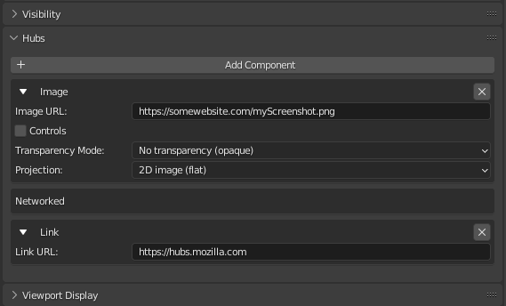
- An ‘Image’ element with an additional ‘Link’ element applied to it.
Other elements such as ‘Model’ and ‘Video’ can also have link elements applied to them, making them clickable web links.
Media Frame
A ‘Media Frame’ is a special type of container that can hold 2D media or 3D objects. They are useful for precisely positioning and snapping items into predetermined positions in your scene, such as an image in a picture frame, or a video on a screen. Media frames are not visible in a Hubs scene unless you are actively dragging a media object around with your mouse cursor. Media can be pinned inside of a media frame so that other users do not accidentally move the media inside of it (useful when presenting to an audience).
- An image being dragged into a ‘Media Frame’ in Hubs.
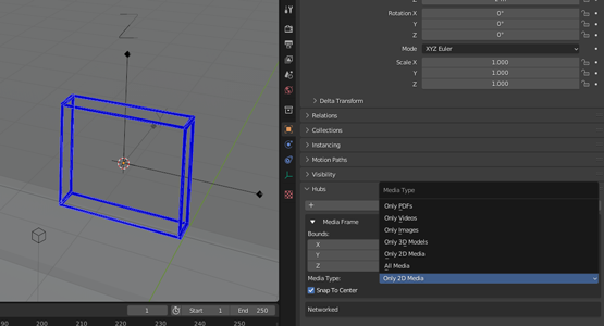
To make a media frame, create an ‘Empty’ in your Blender scene. Since media frames point forwards in the -Y direction, it is useful to change your empty “Display As” type to “Arrows” in the Object Data Properties tab. Once done you can position and orient this item. Next, add the ‘Media Frame’ Hubs component to the empty. You will see a blue cube representing the frame’s default 1m size. To resize a media frame, you cannot scale the empty - you must use the ‘Bounds’ controls in the media frame component to set its size. If you are making a frame for 2D media, you can scale down the Y-axis to make a more flat shape. When placing media into the frame in Hubs, the media will snap to the center along the Y axis and stretch to fill the longest dimension of the media inside the frame (along the X or Z axis, whichever is greater). Note: If you make your media frames too thin along the Y-axis, it may be difficult to place media inside of it in Hubs.
- A ‘Media Frame’ seen in Blender, scaled down along the Y-axis.
The ‘Media Type’ dropdown will let you specify which type of media your frame will accept. This can be limited to only 2D media, specific types of 2D media, 3D models, or any type of media.
Particle Emitter
The ‘Particle Emitter’ component lets you add a particle system to your Hubs scene. As Wikipedia writes, “A particle system is a technique in game physics, motion graphics, and computer graphics that uses many minute sprites, 3D models, or other graphic objects to simulate certain kinds of "fuzzy" phenomena, which are otherwise very hard to reproduce with conventional rendering techniques – usually highly chaotic systems, natural phenomena, or processes caused by chemical reactions.”
That’s a mouthful! Chances are, if you are here reading this then you have a pretty good idea of what a particle system is and what it’s used for, so we will move onto how to set one up in Hubs.
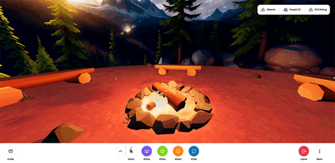
- Multiple Hubs ‘Particle Emitter’ systems emulating a campfire.
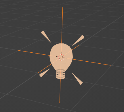
Like many Hubs components, the ‘Particle Emitter’ component is attached to an ‘Empty’ within Blender. Particles are given a directional velocity, so it’s best to use the empty type of “Arrows”. However there are some orientation issues that you will need to be aware of. Creating a default particle system with a start and end velocity of 1 m/s will result in particles that emit in the -Y direction. This is what is considered the “front” facing direction like most of the Hubs Blender components. So you will need to remember that the -Y direction of your arrows correlates to the +Z (“up”) direction with regards to the velocity. In this way, it might be easier to set your empty display mode to something else like a cube and orient and scale it so that it is more obvious when you are looking at it which way is up and down, but that is a matter of personal preference.
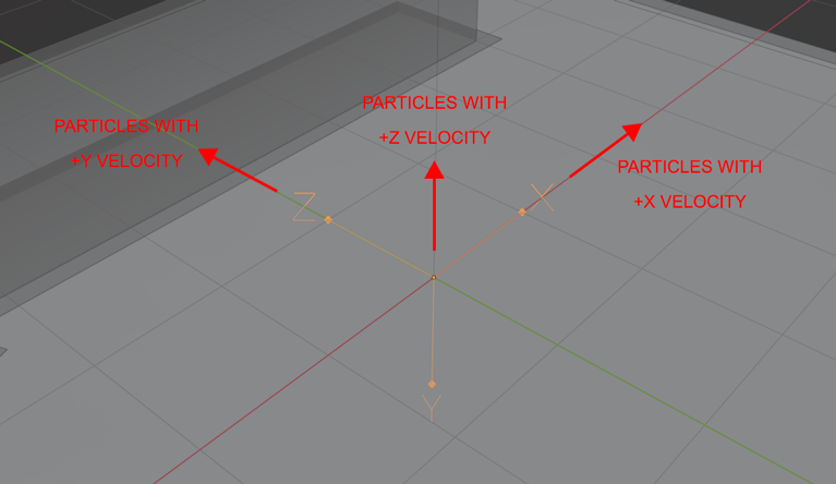
- A ‘Particle Emitter’ empty set to arrows with its corresponding positive velocity directions.
Note: The Y and Z axis are swapped with regards to the particle emitter component. A start/end velocity of 1 in Z will result in particles emitted along the -Y axis. A start/end velocity of 1 in Y will result in particles emitted along the +Z axis. A start/end velocity of 1 in X will result in particles emitted along the +X axis. Because of this, it could be easier to use the X axis for more predictable results, if you are using the “Arrows” empty display type.
As there is currently no preview of particle systems inside of Blender, it will likely take a lot of trial and error to get something that looks good. To make the process somewhat simpler, you can go into Spoke and design your particle system there, and then copy your values to the ‘Particle Emitter’ component in Blender when you are satisfied with how it looks in Spoke. Be aware that Spoke is Y-up and the particles actually emit according to their corresponding velocity axes (as in, a start/end velocity of .5 in Z will actually emit in the positive Z direction, unlike in Blender). Because of this, you will need to either rotate your emitter in Blender, or do the Y/Z conversions yourself.
The ‘Particle Emitter’ component has the following options:
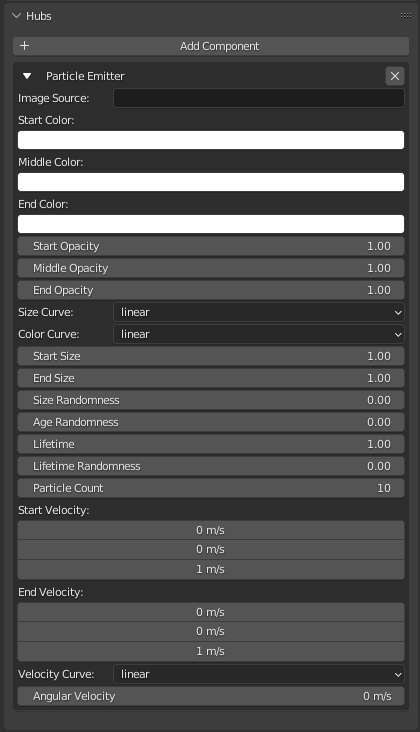
- The ‘Particle Emitter’ options.
Image Source: The URL to the source particle image you wish to use (supports alpha).
Start Color: The color the particle will be when it is first spawned, multiplied on top of the particle color.
Middle Color: The color of the particle at the halfway point of its total lifetime, multiplied on top of the particle color.
End Color: The color of the particle at the end of its lifetime, multiplied on top of the particle color.
Start Opacity: The opacity of the particle at the start of its lifetime.
Middle Opacity: The opacity of the particle at the halfway point of its lifetime.
End Opacity: The opacity of the particle at the end of its lifetime.
Size Curve: The curve that defines the start/middle/end points of the size transition along the particle’s age.
Color Curve: The curve that defines the start/middle/end points of the color transition along the particle’s lifetime.
Start Size: The size of a particle at the start of its lifetime, in meters.
End Size: The size of the particle at the end of its lifetime before it is despawned.
Size Randomness: The amount of variation between particle starting sizes.
Age Randomness: The amount of variation between when particles are spawned.
Lifetime: The maximum age (in seconds) of a particle before it is respawned.
Lifetime Randomness: The amount of variation between particle lifetimes.
Particle Count: The total number of particles visible at any given time for this emitter.
Start Velocity (X/Y/Z): The speed (in m/s) in which a particle travels at the start of its lifetime.
End Velocity (X/Y/Z): The speed in which a particle travels at the end of its lifetime.
Velocity Curve: The curve that defines the start/middle/end points of the velocity transition along the particle’s lifetime.
Angular Velocity: The amount of rotational speed applied to a particle.
Simple Water
The ‘Simple Water’ component is a quick way to generate an animated water surface in your Hubs scenes. It has various controls for wave height and speed, and of course color.
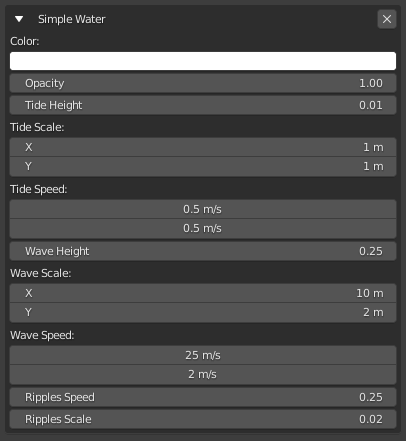
- The ‘Simple Water’ settings.
The component gets applied to an ‘Empty’ in Blender and has a default size of 10m x 10m. Because of this (and since Blender has no “Plane” empty shape) it’s a good idea to set your empty “Display As” setting to “Cube” with a size of 5m (the half-width), and scaled down in the Z axis until it is nearly flat. Upon doing so you can position it in your scene and have a pretty good idea of where it will be.
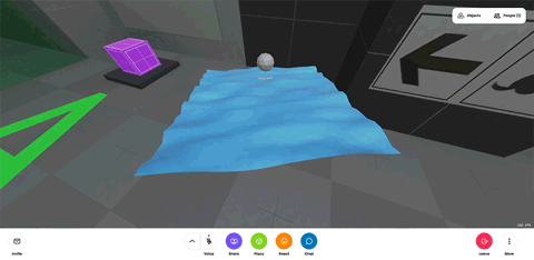
- A small ‘Simple Water’ example asset.
Spawner
A ‘Spawner’ component allows you to spawn multiple copies of a grabbable object into the scene. After one is grabbed, another copy of the same object will appear at the original position, ready for someone else to come by and grab one. Objects spawned this way will remain in the scene unless they are manually deleted, either via the object context menu, or the room object list.
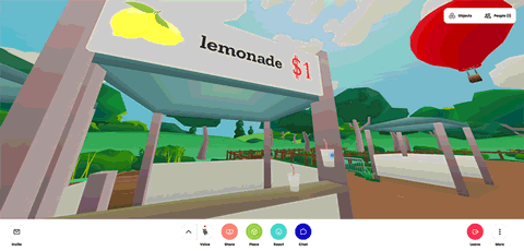
- A ‘Spawner’ that spawns cups of lemonade with gravity enabled.
To grab an object from a spawner, mouse-over the object with your cursor. The cursor will turn blue indicating that the object is interactive. Press and hold the left mouse button and move the cursor away from the starting point to grab the object. While holding an object, you can scroll the mouse wheel to move the object closer or further away from you. Spawned objects can be inspected via the right-click menu just like objects added via the ‘Model’ component, and are sized and positioned the same way.
Spawners have one additional option called ‘Apply Gravity’. When enabled, objects will fall to the floor in a realistic fashion when the user lets go of the mouse button while holding a spawned object. By default, dropped objects will stay in place if the user lets go of the mouse button while the mouse is still.
A word of caution: Be careful spawning high poly meshes with a spawner as too many high poly meshes can have a huge impact on room performance.
Text
Hubs uses a version of the Troika-three-text package for three.js. While each parameter has a tooltip when hovering over it in Blender, you can also read the documentation for each parameter on the Troika documentation page.
You can also play with this handy visualization of the Troika Text parameters to help you understand how they work.
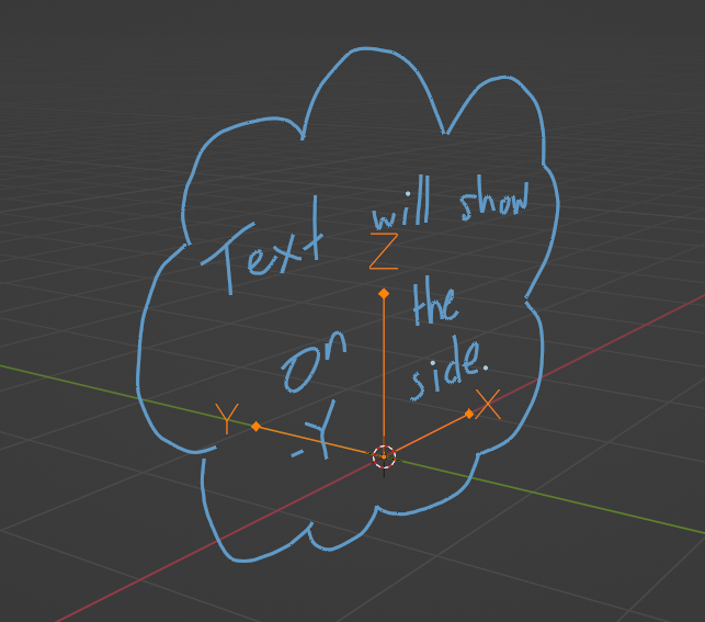
Usage: It is recommended that you use an Empty object set to the Arrows type in Blender. Then, apply the Text component. By default, the text will display on the -Y facing side.
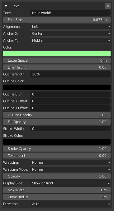
- Lots of options– mouse over them in Blender for more detail.
Waypoint
The 'Waypoint' component can be used to tell Hubs where visitors should start or ‘spawn’ in your scene. It can also be used as a shortcut for visitors to ‘jump’ to a particular spot. By combining its various settings, the Waypoint component can be used to simulate sitting in a chair or otherwise being positioned in one spot–with or without the ability to leave it.
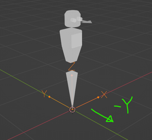
The Waypoint component has the Hubs visitor facing -Y by default. Rotate the object to change the direction. The robot avatar gizmo is there to help you know where your head/eyes will be, as well as to help you visualize the scale of an avatar.
Usage: It is recommended that you create an Empty object in Blender, then apply the Waypoint component. The position and orientation of the object will affect the spawning position and orientation. NOTE: Currently, Hubs supports Waypoints that are rotated on their vertical axis. Any rotation on the other axes is ignored.
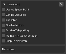
Use As Spawn Point: Hubs will consider this a valid place to spawn visitors entering the space. Spawn points are chosen randomly, but Hubs tries to avoid using the same one repeatedly.
Can Be Occupied: Flags the Waypoint as ‘occupied’ when someone uses it. Can keep others from using it while occupied.
Clickable: Visitors may click the Waypoint to jump to it. Visible when Hubs menus are toggled.
Disable Motion: Locks the visitor in place, disabling movement. The visitor may still look around and interact with things.
Disable Teleporting: While using this Waypoint, the user may not teleport. Use with caution as visitors will usually need a way to escape a Waypoint.
Maintain Initial Orientation: When ON, a visitor will continue to face the same direction they were facing when they click on the Waypoint, effectively ignoring the Waypoint’s orientation. A stool would be a good example of something where you may not want to define the starting orientation.
Snap To NavMesh: Attempts to make the visitor snap to the nearest area on the NavMesh (navigable floor plan). Without this setting, it’s possible to make someone float in mid-air.
Lights
Ambient Light
While not physically accurate, the ‘Ambient Light’ component will apply a uniform light from all directions. It can be used as a quick way to add brightness or tinting to the scene, but is generally considered inferior to using a physically-based workflow. Considered a legacy component, but still useful in some cases. The location of an Ambient Light is unimportant, and often left at the origin (0,0,0). By it’s very nature, there is no shadow cast by an ambient light source.
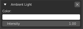
Color: Opens a typical color picker.
Intensity: Overall brightness. Values above 1.0 may cause unwanted effects.
Directional Light
The 'Directional Light' component creates a dynamic light source (also known as a punctual light) that emits light from a single direction.
A Directional Light is best made with an Arrows empty in Blender. When the Directional Light component is added, its light rays will travel along the negative Y direction. The light rays attempt to mimic light from a faraway light source like the sun, so all of its rays travel parallel to one another. NOTE: While dynamic lights are computationally expensive, often, a single Directional Light is used when targeting less powerful devices, such as VR or mobile devices, and you still must have a dynamic light source for a particular design.
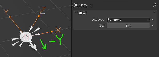
- The forward facing direction of a ‘Directional Light’ component.
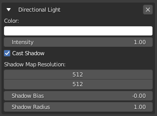
- The ‘Directional Light’ component and its properties.
Color: Opens a typical color picker.
Intensity: Overall brightness. Values above 1.0 may cause unwanted effects.
Cast Shadow: Enabling shadows enables the parameters below. Note: Don’t forget to put a Shadow component on the objects and surfaces you desire, otherwise a light’s shadow will not appear. Shadows may not be visible on some devices by default.
Shadow Map Resolution: Higher values produce crisper, but more computationally expensive shadows. Try to keep these values as low as possible, especially if you are using multiple shadow-casting lights. Use powers of 2: 64, 128, 256, 512, etc.
Shadow Bias: Best to leave this setting at a default value of -0.003.
Shadow Radius: How far away (in meters) from the light source shadows begin casting.
Hemisphere Light
The 'Hemisphere Light' is considered somewhat of a legacy type, but can still be useful for quick and simple lighting setups. It simulates the effect of light from the sky, while adding a second set of light rays that come from the ground. Hemisphere lights do NOT cast shadows. Hemisphere lights are not recommended for physically-based workflows. Instead, consider using a .HDR image with the 'Environment Settings' component.
Usage: Add an ‘Empty’ object in Blender, then apply the Hemisphere Light component. Only the orientation matters, but you’ll likely leave it unrotated. NOTE: There is currently no visual gizmo for the Hemisphere Light component.
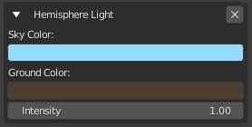
Sky Color: Light rays from above will be this color.
Ground Color: Light rays from below will be this color.
Point Light
The Point Light component creates a dynamic light source (also known as a punctual light) that emits light in all directions from a single point. It has the ability to cast shadows.
Usage: Add an ‘Empty’ object in Blender, then apply the Point Light component. Only the location matters since all the light rays emit outward.
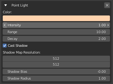
Color: Color of the light rays.
Intensity: Brightness of the light. From the threejs documentation: “Intensity is the luminous intensity of the light measured in candela(cd).”
Range: How far (in meters) the light rays can travel. Leave at 0 for infinite distance.
Decay: The amount the light dims along the distance of the light. 0 = no Decay, 1 = Inverse Falloff, 2 = Inverse Square Falloff. Note: A Decay value of 2 will produce the most realistic lighting behavior, also known as ‘physically-based’.
Cast Shadows: Enabling shadows enables the parameters below. Note: Don’t forget to put a Shadow component on the objects and surfaces you desire, otherwise a light’s shadow will not appear. Shadows may not be visible on some devices by default.
Shadow Map Resolution: Higher values produce crisper, but more computationally expensive shadows. Try to keep these values as low as possible, especially if you are using multiple shadow-casting lights. Use powers of 2: 64, 128, 256, 512, etc.
Shadow Bias: Best to leave this setting at a default value of -0.003.
Shadow Radius: How far away (in meters) from the light source shadows begin casting.
Spot Light
The Spot Light component creates a dynamic light source (also known as a punctual light) that emits light in a cone shape from a single point. The cone shape can be adjusted to be wide or narrow and have a hard or soft edge. It has the ability to cast shadows.
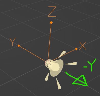
Usage: Add an ‘Empty’ object in Blender, then apply the Spot Light component. The light’s position and orientation determine where the light is pointed. By default, the light rays travel in the negative Y direction.
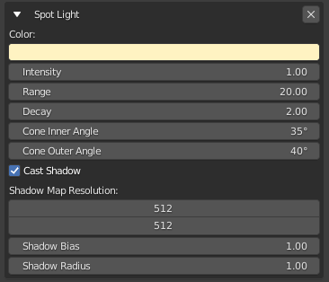
Color: Color of the light rays.
Intensity: Brightness of the light. From the threejs documentation: “Intensity is the luminous intensity of the light measured in candela(cd).” Range: How far (in meters) the light rays can travel. Leave at 0 for infinite distance.
Decay: The amount the light dims along the distance of the light. 0 = no Decay, 1 = Inverse Falloff, 2 = Inverse Square Falloff. Note: A Decay value of 2 will produce the most realistic lighting behavior, also known as ‘physically-based’.
Cone Inner Angle: Angle in degrees for the cone of light that starts in the center of the light.
Cone Outer Angle: Angle in degrees for the cone of light that starts from the Inner Angle and goes to the outer edge of the light cone.
Cast Shadows: Enabling shadows enables the parameters below. Note: Don’t forget to put a Shadow component on the objects and surfaces you desire, otherwise a light’s shadow will not appear. Shadows may not be visible on some devices by default.
Shadow Map Resolution: Higher values produce crisper, but more computationally expensive shadows. Try to keep these values as low as possible, especially if you are using multiple shadow-casting lights. Use powers of 2: 64, 128, 256, 512, etc.
Shadow Bias: Best to leave this setting at a default value of -0.003.
Shadow Radius: How far away (in meters) from the light source shadows begin casting.
Media
Audio
The ‘Audio’ component attaches to an empty and lets you play an audio file hosted on the web via the ‘Audio URL’ field. It has the same options as the ‘Video’ component and operates in much the same way. Audio files are positional by default, but can be made non-positional via the accompanied ‘Audio Params’ component under the ‘Audio Type’ dropdown. This is useful for ambient background audio that you don’t necessarily want to sound as if it’s coming from a particular place in your scene.
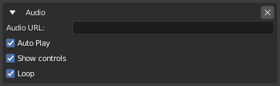
- The ‘Audio’ component and its settings.
If you wish to conceal the source of your audio file, you can attach an additional ‘Visible’ component to it, and uncheck the ‘Visible’ check-box. However this will make it impossible to either pause or adjust the volume for this particular audio source.
Adding an audio component to your object will also add ‘Networked’ and ‘Audio Params’ components automatically, which are necessary for the audio to work properly.
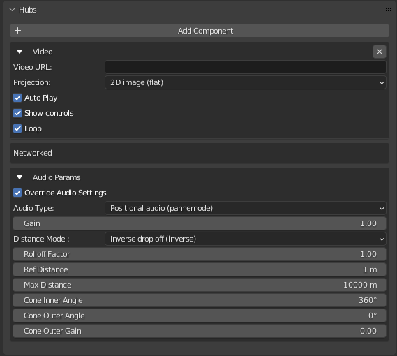
Audio Params
The ‘Audio Params’ component is added automatically when certain other Hubs components are added to an object (such as a video or an audio target) and allows the user to override scene audio settings at a per-object level. This is useful if you want to make sure a video is never too loud, or to make audio target “speakers” loud and heard from further away than regular spoken audio.
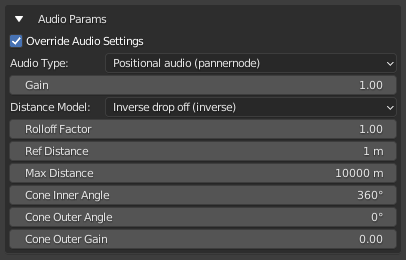
- The ‘Audio Params’ component.
See the ‘Audio Settings’ component section for information about what each and every option does.
Audio Source
The ‘Audio Source’ component is used in conjunction with the ‘Audio Target’ component and lets you designate a source area inside which a Hubs user’s spoken audio will be transmitted and re-broadcast at a target location. It works in much the same way as a microphone and speakers: the microphone is the audio source, while the speakers are the audio targets. Currently this only works for spoken audio and not other media sources such as videos placed inside the ‘Audio Source’ volume.
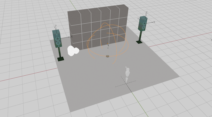
- A sample Hubs scene with an ‘Audio Source’ volume placed near a microphone.
To make an audio source, first create an 'Empty' inside of Blender. Change the empty ‘Display As’ type to ‘Sphere’ - this will show you the volume inside which a Hubs avatar must be positioned in order to be heard through the speakers. Give the empty object a unique name such as 'Audio Source 1', or something you will identify later. With the object selected, in the 'Object Properties' panel go to the 'Hubs' section and click '+ Add Component' and add the one called 'Audio Source'.
- The ‘Audio Source’ component settings.
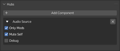
From here you can choose whether only room moderators can use the mic or if everyone can via the ‘Only Mods’ option. 'Mute Self' makes it so that you cannot hear your own voice over the loud speakers while you are speaking, which can be distracting. This is enabled by default. Toggling ‘Debug’ mode on will show some useful info about the audio inside of the Hubs room, but you'll want this off before you publish your scene. When you are testing this scene in Hubs, be sure to go into the ‘Preferences’ and enable “Show Audio Debug Panel” or the debug information will not be visible.
Audio Target
The ‘Audio Target’ component is used in conjunction with the ‘Audio Source’ component and lets you specify the place (or places) in which spoken audio will be heard when a Hubs user is standing within an ‘Audio Source’ volume.
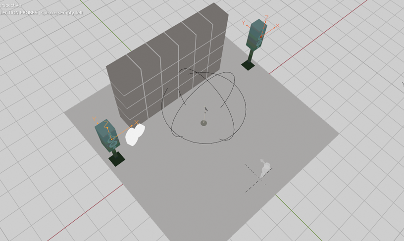
- A sample Hubs scene with two ‘Audio Target’ empties placed in front of speakers.
To make an audio target, create an 'Empty' and call it something like 'Speaker 1' (or whatever you want). Position it where you want your audio to come from in your scene. The negative Y direction is the forward facing direction of the audio, so using an empty of type “Arrows” is best. It's important to orient the audio target the correct way as it is not only positional but directional as well (ie standing behind the speaker is not as loud as standing in front of it). You can have more than one ‘Audio Target’ point to the same source for multi-speaker arrangements. In the 'Object Properties' tab, add a Hubs Component called 'Audio Target', and then choose your audio source from the dropdown menu; only objects with the ‘Audio Source’ component will show up in this list.
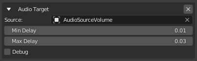
- The ‘Audio Target’ component.
'Min Delay' and 'Max Delay' can be used to simulate a sort of echo-like effect in your scene. For larger environments you might have more delay (so a greater difference between min and max), while in smaller spaces you might not want any at all. Delay is measured in seconds. Play with the settings to find what works best for your application. ‘Debug’ works the same way as it does for ‘Audio Source’ and will give you some visual feedback about the shape of the cone of the audio as well as its falloff. Additionally, while in debug mode you will hear a “hiss” sound from your speakers, indicating that they are indeed working. The best way to test audio settings for this type of setup is to have two or more users in the Hubs room (one speaking and one listening).
Adding an ‘Audio Target’ component to an empty will also automatically add an ‘Audio Params’ component, where you can adjust the volume of this speaker (‘Gain’) and a host of other audio settings. See ‘Audio Settings’ for more information about these settings.
Audio Zone
An ‘Audio Zone’ is a special volume in your Hubs scene inside which you can override audio settings. It is useful for creating private spaces in your scene outside of which audio cannot be heard from within the defined volume. Audio zones affect both spoken audio as well as media audio that are within the audio zone.
Image
The ‘Image’ component lets you add images to your Hubs scene via a remote image URL field. Unlike static textures in your scene, these images can be reloaded and updated dynamically by updating the source file. They can also be inspected via the right-click menu, and can have additional functionality such as the ‘Link’ element added to them so that they are clickable links in your scene.
To use the ‘Image’ component, create an empty and apply the ‘Image’ component to it. The image will face forwards in the -Y direction, so it is useful to change your “Display As” dropdown to “Arrows” in the ‘Object Data Properties’ tab. Once positioned and oriented in your scene, if you would like a visual representation of the size of your image, you can change the “Display As” mode to “Cube”. The default image size is 1m square, so you will need to change your half-width of the cube to .5m (so that it is 1m x 1m). You can also scale down the cube in the Y direction so that it’s roughly flat looking - the image will be positioned in the center along the Y-axis. With all of that done, you can scale the cube empty to any size that you like while having a clear idea of how large it will appear in your Hubs scene.
- Two images applied to a 6m x 4m wall. The one on the left is a 1m image; the other, 2m.
The ‘Controls’ option lets you determine whether there are additional controls on the image when the user is holding down the space bar to open the object menu. These controls include inspect mode, local view mode, a button to open the image link in a new tab, and a button to refresh the image in the event that the source image was overwritten and needs to be updated. With the ‘Controls’ option disabled however, these options will not appear.
- An image element with the controls overlaid on top.
Lastly is the ‘Projection’ type dropdown. By default this is set to “2D image (flat)”, which is the correct setting for traditional flat images. The second option is called “Spherical (360-equirectangular)” and allows for special 360-degree image captures to be displayed inside the faces of a sphere. This is commonly used for background images when scaled up very large (be sure to disable the controls first), but can also be used as little portals that users can step into to look around the 360-degree environment.
- Stepping into a default 1m (radius) spherical image.
It is best to set your empty’s “Display As” setting to “sphere” in this case, and leave it at the default 1m (radius) setting. To scale the spherical photo object, use Blender’s standard scale transform tool - scaling the empty’s visible display size in the “Object Data Properties” tab will not resize the image object.
Model
The ‘Model’ component lets you spawn a GLB model directly in your Hubs scene from a URL. It is different from placing a model directly in your source Blender scene in that models added via the ‘Model’ component can be right-clicked and inspected, allowing users to get a closer look at a model from all angles. Additionally, while inspecting a model, users can click the ‘Link’ button to download the GLB file.
- Inspecting a model of a blue cube added via the ‘Model’ component.
Like many Hubs components, the ‘Model’ component gets attached to an Empty in Blender and faces the -Y direction. The model will come in at its original scale, positioned according to its own origin (from the source file). If you would like to adjust the scale of the model that is spawned, you can scale the empty in Blender prior to exporting the scene.
Video
The ‘Video’ component is yet another 2D Hubs scene element that gets applied to an ‘Empty’ and will display a video in your Hubs scene. It too works like an ‘Image’ element and is placed, oriented and scaled the same way. (See the ‘Image’ element section for more information.) It has a ‘Video URL’ field that lets you specify a link to the video you want to play. Hubs supports many video formats - as many as your browser supports! A commonly used one is .mp4.
- The ‘Video’ component and its default parameters seen in Blender.
Like images, you can change your ‘Projection’ type from “2D image (flat)” to “Spherical (360-equirectangular)”, allowing Hubs users to step inside of a 360-degree video. The video component has three additional options. ‘Auto Play’ lets you choose to have the video automatically play when the scene is loaded. If unchecked, the video will not play until someone presses the play button. ‘Show Controls’ determines whether there are play/pause and volume up/down buttons overlaid on top of the video when a user mouses-over the video. If these controls are disabled, it will not be possible to do these actions. Lastly the ‘Loop’ option lets you specify whether you want the video to automatically play again when the end is reached.
Videos are networked by default, meaning that if a user clicks to pause the video, it will pause for everyone in the room. Additionally, an ‘Audio Params’ component is automatically attached to the object when you add a ‘Video’ component, allowing you to specify audio settings unique to this video. This would allow you, for example, to limit the distance that the audio can be heard from a video source, without affecting the distance that speech between users can be heard. (See ‘Audio Params’ for more information about audio settings.)
Video Texture Source
The ‘Video Texture Source’ component is used in conjunction with the ‘Video Texture Target’ component and lets you specify which Blender camera is the source for your in-room video textures.
Unlike the way a lot of the Hubs components work, the ‘Video Texture Source’ component attaches directly to a Blender camera object and not an empty. Once applied to your camera object, you will be presented with the following options. ‘Resolution’ lets you specify the size of the video signal that will be passed to the video texture, and ‘FPS’ lets you choose the frame-rate. By default these values are 1280x720 and 15, respectively. Be careful setting these values too high as they can really start to impact performance. The general rule is to use as low settings as possible while still achieving the look you are after. The default settings are generally fine for most hardware.
It can be useful to set your ‘Video Texture Source’ camera as your “active camera” in Blender and create a 3D viewport showing the camera view (View > Cameras > Active Camera). This will give you a clear idea of what the video texture will be displaying in your Hubs scene.
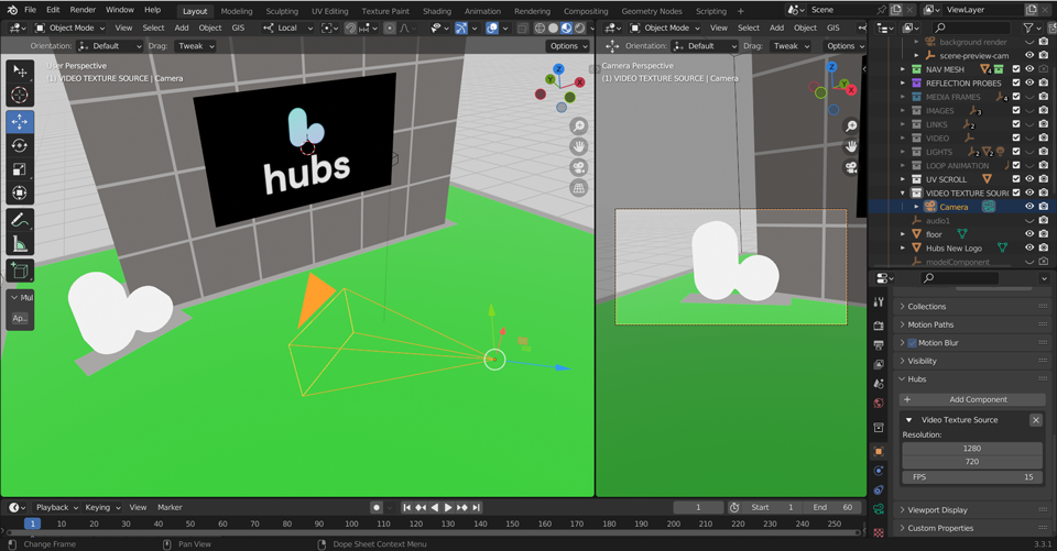
- A split view of Blender showing what the ‘Video Texture Source’ camera sees (right).
Video Texture Target
The ‘Video Texture Target’ component works with the ‘Video Texture Source’ component and lets you determine a material in your scene whose texture will be replaced with the video feed coming from the source camera. The component itself is attached directly to the material via the “Material Properties” tab, and not on the “Object Properties” tab like most Hubs Blender components.
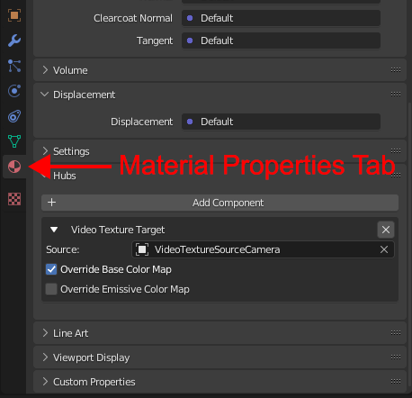
- The ‘Video Texture Target’ component in the “Material Properties” tab.
Once applied to the material, you will be able to select your camera from the ‘Source’ dropdown menu. Only cameras with the ‘Video Texture Source’ component will show up in this list. The material you want the video texture to display on must have a texture assigned to the diffuse and/or emissive channels in the shader editor for this material, or it won’t work. This can be a 16x16 blank image - it doesn’t matter what it is - the component just needs something to swap out.
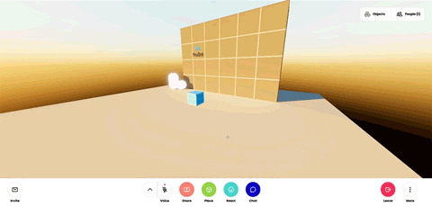
- An animated camera feeding a video to a ‘Video Texture Target’.
Make sure that the UV’s of the face you are sending the video to are unwrapped so that they stretch to fill the entire UV space, and that they are oriented properly. Lastly, and this is important, make sure that your resolution settings in your ‘Output Properties’ tab in Blender are set to the same aspect ratio as your source camera prior to exporting your scene. This does not have to be the exact resolution as your ‘Video Texture Source’ camera (tho it can be), but the aspect ratio is what matters. The ‘Frame Rate’ here has no impact on the video feed (that is set in the ‘Video Texture Source’ component).
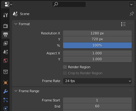
- Be sure to set this before you export your scene!
The ‘Video Texture Target’ component can also be used on Avatars. In this case, the video feed source is your device’s camera or webcam and not a virtual scene camera with the ‘Video Texture Source’ component. To enable the camera in Hubs while using an avatar with a video texture target, press Share > Avatar Camera in the bottom UI bar. This will replace the original texture with your camera feed, allowing for some fun webcam-enabled avatars.
For more information about both ‘Video Texture Source’ and ‘Video Texture Target’, check out the stream that the Hubs team did, viewable on YouTube.
Object
Ammo Shape
The ‘Ammo Shape’ component lets you add physics collision properties to a mesh in your scene so that other physics-enabled objects can interact with and bump into it. This interaction only happens with objects that are spawned into or otherwise dragged into the scene, and has zero impact on the movements of avatars (which are driven only by the nav mesh). This component is applied directly to the mesh that you wish to enable collision for.
Objects exported via the Hubs Blender Exporter receive collision properties by default, however if you wish to override the default settings and have more control over the collision shapes applied, you can add an additional Ammo Shape component to your mesh.
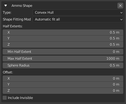
- The ‘Ammo Shape’ component and its properties.
The ‘Type’ dropdown lets you choose from different collision shape presets. The presets are:
Box Collider: A box-shaped primitive collision shape.
Sphere Collider: A primitive collision shape in the shape of a sphere.
Convex Hull: A convex hull wrapped around the object’s vertices. A good analogy to describe how this works would be a palette of boxes wrapped in shrink wrap.
Mesh Collider: A shape made of the actual vertices of the object. This is the most accurate but can be computationally expensive for complex meshes and should be used with caution.
For information about the remaining Ammo Shape options, mouse-over them in Blender to read the tooltips.
Billboard
A ‘Billboard’ component is used any time you want an object to always be facing the user. This works for either 2D media or 3D models (where the “front” of the model is the -Y facing direction when exported from Blender). We traditionally use billboards for things such as sprites generated by particle emitters so that the particle images are always fully in view: you never see a particle at an oblique angle, nor the back-facing invisible side, but always the exact front. This is a local effect in that you yourself see the billboarded object facing you, while other people in the same Hubs room will see the same objects facing them on their screens.
Billboard components are particularly useful for objects such as text that you want to make sure always faces the user, and are commonly used for distant background elements as well. For example, a tree in the distance where a user could never walk to might be better off as a faux 2D cutout of a foreground tree, and with a Billboard component added to it, the user will always see the full image of the tree from any point in the scene. Billboards might also be used on foreground tree branches or leaves so that the tree canopy appears more full with fewer gaps. This is commonly done in video games.
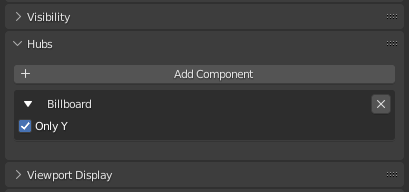
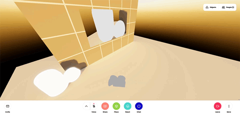
The Billboard component has only one option, a radio button labeled ‘Only Y’. When this button is checked, the object with the billboard component will only spin on its vertical axis (in Hubs the vertical axis is Y) to rotate towards the user, and not fully rotate upwards or downwards to face the viewer’s exact camera position. By default, with the button unchecked, the behavior will be the latter.
- The cube on the left has the default Billboard settings. On the right, “Only Y” was selected.
Frustum
The Frustum component fixes a problem you might have when using an animated object. Some animated objects are large or move across a large distance causing the object to disappear when it nears the edges of your view in Hubs.
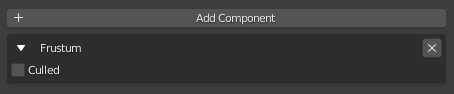
- The ‘Frustum’ component.
Culled: Applying a Frustum component with Culled set to OFF will ensure that the object always renders, no matter how far off-screen the object is. Use only when needed.
Shadow
The ‘Shadow’ component is a special component that allows 3D objects (or even avatars) in your scene to either cast or receive shadows, used in conjunction with dynamic lights. For example, if you have a dynamic light in your scene and would like your avatar to cast a shadow on the floor from this light source, the avatar will need to have a ‘Shadow’ component with ‘Cast Shadow’ enabled, and the floor of your scene will need to have one with ‘Receive Shadow’ enabled. Nothing will cast or receive shadows by default.
- An animated spotlight shining on a sphere and casting a shadow on the floor.
Also worth noting is that Hubs does not have dynamic shadows on by default. If you are not seeing your shadows, it’s quite possible that you do not have them enabled. To turn them on, go to the ‘More’ menu, click ‘Preferences’, then under the ‘Misc’ tab, make sure “Enable Real-time Shadows” is turned on. Dynamic lights also do not display when your Hubs material quality settings are set to “Low”, which is the default setting for mobile devices (including stand-alone VR devices).
Visible
The ‘Visible’ component is a simple component that lets you make an object invisible in your Hubs scene while retaining the functionality associated with that object. For example, it is common to apply the ‘Visible’ component to your navigation mesh so that it’s not showing in your Hubs scene, yet you can still walk around on it. It’s sometimes useful to add a ‘Visible’ component to an ambient audio source that you want to be heard without the controls or source of the file showing.
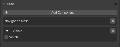
- A Hubs navigation mesh with an additional ‘Visible’ component added, toggled off.
Scene
Audio Settings
The ‘Audio Settings’ component is added in the “Scene Properties” tab in Blender and lets you override the default audio settings for your entire Hubs scene. It has independent controls for spoken avatar audio as well as scene media audio (such as videos).
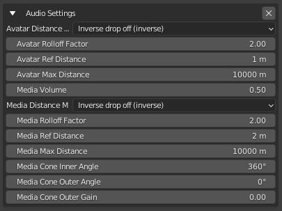
- The Hubs ‘Audio Settings’ component options.
These settings can be further overridden on a per-object basis by adding an additional ‘Audio Params’ component to that object. So for example, if you wan media volume to be at a specific level for your entire scene, you set those settings in ‘Audio Settings’, but if you want one video in particular to be louder than the rest, you would set that in an ‘Audio Params’ component attached to that particular video.
The Audio Settings options are:
Avatar Distance Model: The algorithm used to calculate audio rolloff.
Avatar Rolloff Factor: A double value describing how quickly the volume is reduced as the source moves away from the listener. 0 to infinity.
Avatar Ref Distance: A double value representing the reference distance for reducing volume as the audio source moves further from the listener.
Avatar Max Distance: A double value representing the maximum distance between the audio source and the listener, after which the volume is not reduced any further.
Media Volume: The relative volume of media (videos or audio) played in the scene.
Media Rolloff Factor: A double value describing how quickly the volume is reduced as the source moves away from the listener. 0 to infinity.
Media Ref Distance: A double value representing the reference distance for reducing volume as the audio source moves further from the listener.
Media Max Distance: A double value representing the maximum distance between the audio source and the listener, after which the volume is not reduced any further.
Media Cone Inner Angle: A double value describing the angle, in degrees, of a cone inside of which there will be no volume reduction.
Media Cone Outer Angle: A double value describing the angle, in degrees, of a cone outside of which the volume will be reduced by a constant value, defined by the ‘Media Cone Outer Gain’ attribute.
Media Cone Outer Gain: A double value describing the amount of volume reduction outside the cone defined by the ‘Media Cone Outer Gain’ attribute. Its default value is 0, meaning that no sound can be heard.
Environment Settings
This is one of a handful of components that gets added in Blender’s Scene Properties tab. This component is required in order to have a background image or color. It’s also used to set a global reflection probe image that you will see reflected in metallic and/or shiny objects. It is also where you can define a ‘look’ for your scene controlled by post-processing effects, similar to making color adjustments on a film or video.
To use these more effectively, and since there’s no way to preview these in Blender, you can add the following to the end of a Hubs URL and reload:
?envSettingsDebug
Then, you’ll be able to tweak the parameters in a browser, then use those values back in Blender before you export again.
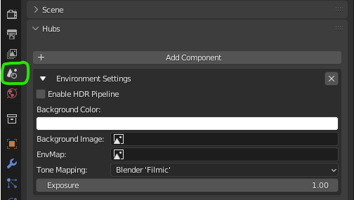
Enable HDR Pipeline: Checking this enables Bloom below.
Background Color: Opens a typical color picker. (NOTE: THIS DOES NOT WORK CURRENTLY)
Background Image: Expects an equirectangular format image to wrap a 360-degree skybox around the scene. Choose an image you have loaded into Blender. Using an image with high dynamic range (.HDR) can greatly improve the realism of your lighting.
EnvMap: Expects an equirectangular format image to use as a global reflection probe. Highly shiny and/or metallic surfaces will reflect this image. Choose an image you have loaded into Blender. Using an image with high dynamic range (.HDR) can greatly improve the realism of your lighting.
Tone Mapping: Dropdown with preset defaults. Experiment with different looks. These mostly affect brightness and contrast and are applied as a post-processing effect.
Exposure: When using an HDR Pipeline, this controls overall exposure of the scene. If, for example, your scene appears too dark, try raising this by subtle amounts.
Bloom: Accessible when ‘Enable HDR Pipeline’ is checked. Bloom adds a post-processing effect that makes bright areas of the screen appear to glow or ‘bloom’ out from the source pixels.
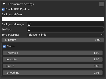
- The ‘Environment Settings’ component and its settings.
Threshold: Values brighter than this will have bloom applied to them.
Intensity: Scales the intensity of the bloom effect.
Radius: Spread distance of the bloom effect.
Smoothing: Makes transition between under/over threshold more gradual.
Fog
This is one of a handful of components that gets added in Blender’s Scene Properties tab. Adding a Fog component creates a fog effect in your scene that obscures things at a distance. There are some limitations with fog such as how it affects semi-transparent objects, so be aware that fog may not always work as intended. When used subtly, fog can provide a greater sense of scale and depth, such as when you use light-blue tinted fog or dark fog in a night scene.
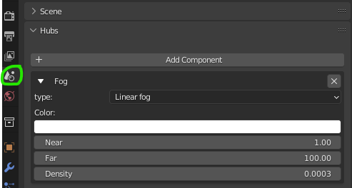
Type: Linear Fog (default) or Exponential Fog. NOTE: Your choice affects which settings are relevant below.
LINEAR FOG: Somewhat easier to control than exponential–fog appears thicker the farther away it is.
EXPONENTIAL FOG: Fog is controlled by a single density value.
Color: Uniform color of the fog.
Near: Sets the near distance (in meters) to the camera fog should start.
Far: Sets the far distance (in meters) to the camera fog should reach.
Density: Sets the overall ‘thickness’ of the fog.
Navigation Mesh
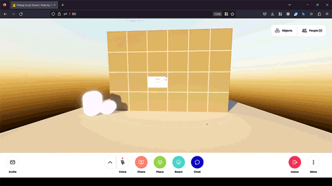
Contrary to popular assumption, Hubs avatars do not navigate the 3D scene using any sort of physics system. There’s no collision checks happening under the hood to keep you from walking through a wall. Instead, Hubs uses an invisible floor mesh called a ‘Navigation Mesh’ (or nav mesh for short) that tells hubs where avatars are allowed to walk or teleport to.
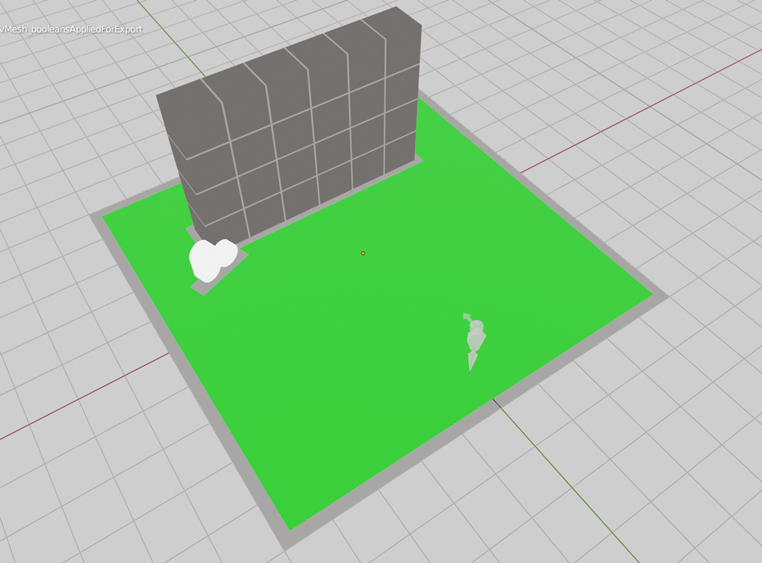
- A sample Hubs scene with a ‘Navigation Mesh’ (shown in green).
The ‘Navigation Mesh’ component gets attached to a duplicated section of floor that has areas cut out for walls and other scene objects that you don’t want avatars to be able to walk through. Navigation meshes must be one mesh object (you cannot have multiple nav meshes in a scene) and all vertices must be welded together so that there are no discontinuous pieces. It’s generally a good idea to also attach a ‘Visible’ component to your nav mesh with its visibility toggled off (unchecked).
Reflection Probes
The ‘Reflection Probe’ element is used to create areas in your scene inside which avatars and objects will be influenced by the colors of a pre-defined reflection cubemap image. It is an advanced technique and when done properly can really enhance the visuals of a scene and make objects and avatars appear more “grounded” in the scene, as if they are being influenced by the same lighting conditions as the rest of the scene. A scene can have multiple reflection probes, each with their own baked image and lighting conditions. Probe volumes can even overlap, creating the effect of a smooth transition as an avatar (for example) travels from one to the next.
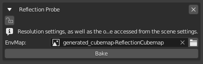
- The ‘Reflection Probe’ component and its settings.